At the start of this class, we has to research historical and contemporary brand analysis. We also had to do design research for personal branding identity.
A classic company I’m looking at is Marvel Studios. Both the Comic’s ‘verse and the Cinematic Universe. The Marvel Cinematic Universe is an American media franchise and shared universe that is centred on a series of superhero films, independently produced by Marvel Studios and based on characters that appear in American comic books published by Marvel Comics.
Meanwhile Marvel Comics is the brand name and primary imprint of Marvel Worldwide Inc., formerly Marvel Publishing, Inc. and Marvel Comics Group, a publisher of American comic books and related media. However in 2009, The Walt Disney Company acquired Marvel Entertainment, Marvel Worldwide’s parent company.
Marvel Comics is the brand name and primary imprint of Marvel Worldwide Inc., formerly Marvel Publishing, Inc. and Marvel Comics Group, a publisher of American comic books and related media. In 2009, The Walt Disney Company acquired Marvel Entertainment, Marvel Worldwide’s parent company.
Four Vectors of Branding
Product – what the organisations makes or sells
Environment – the physical environment of the brand, how it lays out it stall
Communication – how it tells people, every audience, about itself and what it is doing
Behaviour – how its people behave to each other and the world outside
Production:
Marvel as a whole company is a producers of Comic Books which they then have gone on to turn into a Cinematic Universe with each story all interlinked. For some people, they have grown up on Marvel movies. I know that personally I got the comics when I was younger.. I remember reading about Spiderman mainly.. having his poster in my room.. reading about the death of Gwen Stacy and then going on to watch it on the big screen and feeling the emotion of that scene all over again.
In terms of the Marvel Universe.. I feel like everybody in the world knows that they’re in for a good time when they see the flashing of comic book images and the screen fading to red with ‘MARVEL STUDIOS’ written across the screen. Each year Marvel have changed their movie logos.
Environment:
In terms of environment, I feel like the Marvel branding is very simple. They’re almost famous for using the three colours of black, white and red. I really like this approach given that Marvel only ever started out bringing Black and White comics.


Marvel comes across as a very family friendly brand, despite the gore and violence in a lot of their comics originally. We all love a great action fighting scene as the climax of the movie. But even then, there’s no blood.. and if there ever is.. it’s only slightly.
However.. there is one exception to this. And that exception is the Deadpool series. Deadpool is the alias of one Wade Wilson.. a superhuman mercenary. The brand is laid out a lot darker.. with a lot of red in it’s promo material.


Even the promotional posters for Deadpool is darker. It was even rated r.
“Parents know what is appropriate for their children. With this movie, there was no grey area. “Deadpool” is rated R for graphic violence, graphic language, graphic nudity, graphic sexual references and graphic sex — a sex montage, in fact.’ This was posted only by USA Today.
I feel like Marvel definitely split up the rated r from the family friendly movies. They give plenty of warnings and any fan of the comics would know what to expect in these movies.
In terms of physical environment, Marvel has man gift shops around the work. They have their products in the Disney Store on Grafton street. They have their own set ups.

Their set up is dark but clean and cool. It’s very modern and I feel like it really captures what Marvel is.
Communication:
With communication, a big part of this is done through Comic Con. Comic Con is a multi-genre entertainment and comic convention held annually in San Diego, California, United States. There is now one in every country in the world. But with never Marvel movies being released, many of the cast members attend panels. This is where they talk about themselves, the movies and anything they can say about it.
A big part of these Panels is Press Tours. Like the video shows below, the cast members do these panels so that they can release trailers or official posters for their upcoming movies and tease fans about what’s in store for them to see.
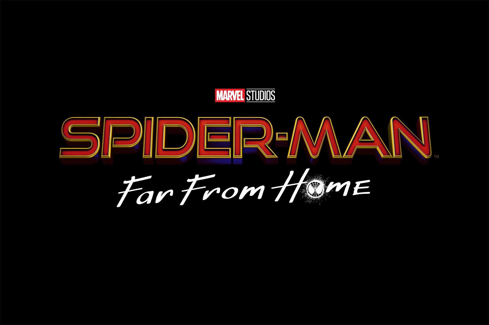
Another form of communication would be the poster releases. Marvel’s newest Spiderman is played by Tom Holland. He’s been in three major Marvel movies. For two of these movies.. he released ‘classified information’ about the posters for the movie which is believed to be a PR stunt.
In the video that was put live on Facebook and has been viewed over 2 million times on youtube, Tom revealed a poster for Avengers Infinity war. He then holds up another sheet of paper which says ‘Marvel Studios, Confidential Do Not Share’

This story made headlines but a lot of people believe that it was a publicity stunt for Marvel as Tom also done this again for his second Spiderman movie.
In an Instagram video on the weekend of Seattle Comic Con, Tom Holland released the name of the new Spiderman movie. Spiderman: Far From Home. Due to him releasing the poster for infinity war a year prior, we believe that this is now a new publicity stunt that will be repeated for Marvel films to come starring Tom.
Behaviour:
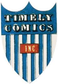
Marvel started in 1939 as Timely Publications, and by the early 1950s, had generally become known as Atlas Comics. The Marvel branding began in 1961, the year that the company launched The Fantastic Four and other superhero titles created by Stan Lee, Jack Kirby, Steve Ditko and many others.

Stan Lee is the face of Marvel. He has had cameo’s in ever Marvel movie ever created since 1989. Now, when watching the movies, you’re waiting to see who he shows up as next. He had has 54 cameos. His first was on the TV movie of ‘The Trial of the Incredible Hulk’. He is definitely a fan favourite and is known across the world as the face of Marvel.
Jack Kirby was one of the founders. He learned how to sketch by tracing over the comics in the newspaper when he was younger. Kirby died in 1994.
Steve Ditko was another founder. He was the artist and co-creator of Marvel Comic superheroes such as Spiderman and Doctor Strange. He studied from Jerry Robinson, the illustrator who created Batman. Steve died recently in June 2018.
Mission Statement:
The Walt Disney Company’s objective, (Marvel Entertainment, LLC, is a wholly owned subsidiary of the Walt Disney Company), is to be one of the world’s leading producers and providers of entertainment and information, using its portfolio of brands to differentiate its content, services and consumer products. The company’s primary financial goals are to maximize earnings and cash flow, and to allocate capital toward growth initiatives that will drive long-term shareholder value.
Evolution of the Marvel Logo:
Back in 1939, in the Golden Age of comics, Marvel was founded under the name Timely Comics. It functioned under that name for eleven years, until 1950. Back then, the Marvel logo and brand weren’t even being considered. The Timely Comics logo consisted of a mostly blue coat of arms, striped white, and featuring a small, red rectangle containing the word “INC.”
By the time the 1950s rolled along, Timely Comics had become Atlas. The not-yet- Marvel Comics logo consisted of what a large number of mainstream companies had already started using in their logos, a globe. Still, seeing as the company’s name was named Atlas, and as the globe had a sash around it, the name fit pretty well.
![]()
It was only in 1957 that the Marvel logo and brand finally dropped other names and remained known only as Marvel Comics. Since then, the logo has changed a bunch of times. The first one featured a black circle on a red background, with the words “Marvel Comic” written in white, and with a golden wheat leaf inside the smaller red circle.
![]()
Next, the Marvel logo featured the simple work MARVEL written in a neat, comic-book font, surrounded by the emoting heads of various superheroes, such as Thor, Ironman, Captain America, Black Widow, and The Thing.
![]()
The next Marvel logo is probably the one most remembered by 90’s kids. Lasting from 1987 until 2002, this Marvel logo was featured on many a TV show, movie, T-shirt, wallpaper, and poster. It featured a red, stylized letter M, with the upper part of the letter forming the word “Marvel”. It also featured the word “Comics”, written in a very funky, edgy font.
![]()
Next came the logo we know today, the simple white Marvel text written on a red background.
![]()
Brand Architecture.
For this we were looking at different kinds of brands. We have been looking at corporate brands, endorsed brands and branded brands.
Corporate brands would be a single identity for a business. Such as Fedex, Starbucks or Coca-Cola.

![]()
![]()
Endorsed brands are brands with multiple identities or a variety of brands. An example of this would be Virgin.

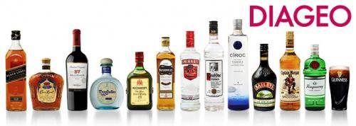
Finally Branded Brands are a number of unrelated brands. An example of this is Diageo.
Marvel would be an endorsed brand. It is now owned by Disney. Marvel also has a lot of other products besides it’s comics and movies. Marvel makes toys, costumes and stationary.
Invented & Reinvented Brands:
Invented brands were created from scratch with no change. Getting it right means success and getting it wrong is failure. An example of an Invented brand would be Lexus.
![]()
Reinvented brands are brands that exist and need a refresh or redesign. They need a new outlook to the company. An example of this would be Eircom/Eir.

In a global market, standing still is not an option when it comes to branding but there is a difference between a rebrand and a brand refresh.
A brand refresh is when a company’s design is out of date. This is usually when there is no company change name. An example of this would be Google.

On August 31, 2009, The Walt Disney Company announced a deal to acquire Marvel Comics’ parent corporation, Marvel Entertainment, for $4 billion or $4.2 billion, with Marvel shareholders to receive $30 and 0.745 Disney shares for each share of Marvel they own.
While Disney did buy Marvel and merge with them, Marvel didn’t rebrand. They continued to stay the same as they were before hand.
Leadership:
Isaac “Ike” Perlmutter is an Israeli-American businessperson and financier. He is the chairman and former CEO of Marvel Entertainment. He was also the owner of Remington Products and Marvel Toys.

Ike is not the most loved man in the company of Marvel. He’s an avid Trump supporter and in turn this lost some support from fans of Marvel.
Donald Trump spoke at his own fundraiser occurring at the same time as the GOP primary debate, claimed that he received multiple calls from Fox News in an effort to try and get him to participate in the event.
During the event, Trump made note that Marvel Entertainment CEO Ike Perlmutter and his wife, Laura, will donate $1 million to the fundraiser. “One of the great, great men of our country in terms of business and talent,” Trump said. A rep for Perlmutter said: “The Perlmutters are thrilled to support their friend Donald Trump in his efforts to help veterans.”

But Marvel is also owned by Disney. Robert Allen Iger is an American businessman who is chairman and chief executive officer of The Walt Disney Company. Before working for Disney, Iger served as the president of ABC Television from 1994–95, and as president/COO of Capital Cities/ABC, Inc. from 1995 until Disney’s acquisition of the company in 1996.

In June 2012, Steven Spielberg, founder of the USC Shoah Foundation Institute for Visual History and Education, presented Iger with the Ambassador for Humanity Award, the Institute’s highest honour. Iger was recognised for his support of the Institute’s work, his longtime philanthropy, and his leadership role in corporate citizenship.
Brand Development:
I would describe myself as a very laid back person. I’m very acceptive of change and I take criticism well. I would prefer to work for small or medium companies. Maybe ones which are just starting up and really need to discover their image. I really enjoy Illustration work with vector imagery.
I like really simple and clean cut designs. Some brands that I really enjoy the branding of would be Spotify, Netflix, Twitter, Youtube, Apple and Facebook.
I think my love of really simple and clean cut designs really reflects on my own style. I have a very big interest in illustrations. Even growing up I was crazy about illustration. I would learn how to draw by tracing pictures in story books that I loved and eventually I found I could draw them myself.


I’ve been doing a good bit of illustration this year. A lot of it was primarily for my Professional practise class but I’m now using it a lot in my advanced graphic design project.
![]()
![]()

I think some of my competition would be other illustrators. Some people’s style can be very detailed but I think my style is very simple. And some people like a lot of detail so I think I might have to try different styles of illustration.
For this project I am researching some other people’s brand manuals. Someone I’ve been looking at was Lydia Paasch. Lydia has a branding manual I found on Behance. And I really like her use of whitespace.

A more famous branding manual I was looking at was for FOX. I like how clean cut their graphics are and I think this is something that I would like to take into consideration with my own designs. This was created by DHNN Creative Agency.


Another branding manual I was looking at was from Michelangelo Greco. I really like his use of grains in his work and I love the minimal, simplistic colour schemes.


However I think his work includes a lot of painting and I don’t think that painting is a very strong skill of mine. But maybe I could use the same idea with his painting work but replace paintings with my own work.
I feel like my strengths would be:
- Good communication skills: In my foundation course of graphics in another college, I took a communications class. I also work with ‘The Five Lamps’ art festival and had to communicate with the client. I also made different posters for multiple stage productions that the college’s drama class put on.
- Good knowledge of Photoshop and Illustrator: I first downloaded a free trial of Photoshop when I was thirteen after hearing about it in my art class. We were exploring different kinds of art. I already loved the computer and art so I figure this was a way forward. I’ve been using mainly Photoshop since then. I’ve also been using adobe illustrator for the last three years and have become more confident with it and could easily use it for other projects.
- Willing to learn and self motivated: For a class last year called Visual narratives, I looked at a lot of different tutorials into getting the different animated effects that I wanted in my video. Because of this I believe that I could go on myself and learn what I need to learn alone instead of having to ask someone for help.
- Presenting work: Last year we focused on presentation a lot and I feel like I can now present my work a lot better in terms of my portfolio and for the client.
- The ability to work in a team: When I done my foundation year, we done a group project to re-brand the Five Lamps Festival. That was a large group project in which I was more than happy to share ideas and work together.
My weaknesses would be:
- Lack of confidence: This is in design but it’s also a personal thing. I’m not hugely confident in myself and I don’t take compliments too well. I’m always ready to improve on something but I rarely feel right taking compliments on my work.
- Underselling myself: I don’t think my work is up to parr with other designers and I will often play my work off like it was nothing and that I didn’t put effort into it when I really did.
- The lack of confidence in being a leader: I am more of a follower. I like when someone has an idea that they want me to work on. But personally I don’t like take charge with a team of people maybe in fear that they don’t like what I offer.
- Fear of failing to meet someone’s needs
My opportunities would be:
- Furthering my skills
- Branching into different areas of graphic designs
- Becoming a freelance graphic designer
The Core idea / Values:
Renidon should be seen as a simplistic, quirky but also clean cut. Renidon focuses on simplicity but also aesthetic. Their main method is illustration.
Name:
In terms of names for my company, we were looking at many different kinds of names. Such as individual names.. like Adidas or Ford. Descriptive names like.. British Airways or Toys’R’Us, abbreviated named like FedEx )Federal Express) or Accenture(Accent on the future). Initial names such as IBM or KLM , names with no meaning like Kodak or IKEA and Conceptual
“An idea can come from anywhere, but getting buy in and seeing it through is tough. In fact, naming can be one of the hardest parts of a branding project.” – Wolff Olins.
In terms of name choosing for my brand, I have looked at a lot of different ideas.. some related to design and some just sounded cool, not going to lie.
- Triadic graphics: Three colours evenly spaces on the colour wheel
- Hierarchy: Organised by levels of importance
- Indefectible: Not liable to fail. I feel like this name would’ve been a lot of pressure to carry.
I then thought about using an anagram of my name.
My name in Irish is Lauren Ní Donnacha. From this, I rearranged different letters like:
- Lidon
- Honda Already a brand
- Laur
But one that really stuck with me was Renidon. This was made by taking the last two letters from Lauren, The Ní and Don from Donnacha.
Lauren Ní Donnacha
I looked into the legal part of this. The only brand I could find with the name was an inflammatory drug.

My mam works in a pharmacy and I’ve asked if she would look into the drug and see if it’s still in use today as the website I was looking at doesn’t say much about when it was made or if it was discontinued. After texting her, she was talking to the pharmacist who insisted that there was no drug they used called Renidon and that the only thing close to that would be Renilon. So Renidon is the name I’m sticking with.
Designing the logo:
Upon designing a logo for Renidon, I took the Paul Rand logo test. But I also took in his principles while I was creating my logo:
- A logo derives meaning from the quality of the thing it symbolizes, not the other way around.
- The only mandate in logo design is that they may be distinctive, memorable and clear.
- Presentation is key
- Simplicity is not the goal. It is the by-product of a good idea and modest expectations.
In terms of colours, I looked into other people’s colour schemes first. The main place I was looking was Behance and I found some swatches from Ebtihaj khan.


I have also been on the Adobe Colour site on their explore page and they have so many different colour schemes.

Another site I found really useful was Coolors


In terms of myself, I think I’m very laid back and calm. I think I might like to be reflected through the colours that I use on my branding as I think it’s important to really put pieces of yourself into your branding.

RED. Physical
Positive: Physical courage, strength, warmth, energy, basic survival, ‘fight or flight’, stimulation, masculinity, excitement.
Negative: Defiance, aggression, visual impact, strain.
Being the longest wavelength, red is a powerful colour. Although not technically the most visible, it has the property of appearing to be nearer than it is and therefore it grabs our attention first. Hence its effectiveness in traffic lights the world over. Its effect is physical; it stimulates us and raises the pulse rate, giving the impression that time is passing faster than it is. It relates to the masculine principle and can activate the “fight or flight” instinct. Red is strong, and very basic. Pure red is the simplest colour, with no subtlety. It is stimulating and lively, very friendly. At the same time, it can be perceived as demanding and aggressive.
BLUE. Intellectual.
Positive: Intelligence, communication, trust, efficiency, serenity, duty, logic, coolness, reflection, calm.
Negative: Coldness, aloofness, lack of emotion, unfriendliness.
Blue is the colour of the mind and is essentially soothing; it affects us mentally, rather than the physical reaction we have to red. Strong blues will stimulate clear thought and lighter, soft blues will calm the mind and aid concentration. Consequently it is serene and mentally calming. It is the colour of clear communication. Blue objects do not appear to be as close to us as red ones. Time and again in research, blue is the world’s favourite colour. However, it can be perceived as cold, unemotional and unfriendly.
YELLOW. Emotional
Positive: Optimism, confidence, self-esteem, extraversion, emotional strength, friendliness, creativity.
Negative: Irrationality, fear, emotional fragility, depression, anxiety, suicide.
The yellow wavelength is relatively long and essentially stimulating. In this case the stimulus is emotional, therefore yellow is the strongest colour, psychologically. The right yellow will lift our spirits and our self-esteem; it is the colour of confidence and optimism. Too much of it, or the wrong tone in relation to the other tones in a colour scheme, can cause self-esteem to plummet, giving rise to fear and anxiety. Our “yellow streak” can surface.
GREEN. Balance
Positive: Harmony, balance, refreshment, universal love, rest, restoration, reassurance, environmental awareness, equilibrium, peace.
Negative: Boredom, stagnation, blandness, enervation.
Green strikes the eye in such a way as to require no adjustment whatever and is, therefore, restful. Being in the centre of the spectrum, it is the colour of balance – a more important concept than many people realise. When the world about us contains plenty of green, this indicates the presence of water, and little danger of famine, so we are reassured by green, on a primitive level. Negatively, it can indicate stagnation and, incorrectly used, will be perceived as being too bland.
VIOLET. Spiritual
Positive: Spiritual awareness, containment, vision, luxury, authenticity, truth, quality.
Negative: Introversion, decadence, suppression, inferiority.
The shortest wavelength is violet, often described as purple. It takes awareness to a higher level of thought, even into the realms of spiritual values. It is highly introvertive and encourages deep contemplation, or meditation. It has associations with royalty and usually communicates the finest possible quality. Being the last visible wavelength before the ultra-violet ray, it has associations with time and space and the cosmos. Excessive use of purple can bring about too much introspection and the wrong tone of it communicates something cheap and nasty, faster than any other colour.
ORANGE.
Positive: Physical comfort, food, warmth, security, sensuality, passion, abundance, fun.
Negative: Deprivation, frustration, frivolity, immaturity.
Since it is a combination of red and yellow, orange is stimulating and reaction to it is a combination of the physical and the emotional. It focuses our minds on issues of physical comfort – food, warmth, shelter etc. – and sensuality. It is a ‘fun’ colour. Negatively, it might focus on the exact opposite – deprivation. This is particularly likely when warm orange is used with black. Equally, too much orange suggests frivolity and a lack of serious intellectual values.
PINK.
Positive: Physical tranquillity, nurture, warmth, femininity, love, sexuality, survival of the species.
Negative: Inhibition, emotional claustrophobia, emasculation, physical weakness.
Being a tint of red, pink also affects us physically, but it soothes, rather than stimulates. (Interestingly, red is the only colour that has an entirely separate name for its tints. Tints of blue, green, yellow, etc. are simply called light blue, light greenetc.) Pink is a powerful colour, psychologically. It represents the feminine principle, and survival of the species; it is nurturing and physically soothing. Too much pink is physically draining and can be somewhat emasculating.
GREY.
Positive: Psychological neutrality.
Negative: Lack of confidence, dampness, depression, hibernation, lack of energy.
Pure grey is the only colour that has no direct psychological properties. It is, however, quite suppressive. A virtual absence of colour is depressing and when the world turns grey we are instinctively conditioned to draw in and prepare for hibernation. Unless the precise tone is right, grey has a dampening effect on other colours used with it. Heavy use of grey usually indicates a lack of confidence and fear of exposure.
BLACK.
Positive: Sophistication, glamour, security, emotional safety, efficiency, substance.
Negative: Oppression, coldness, menace, heaviness.
Black is all colours, totally absorbed. The psychological implications of that are considerable. It creates protective barriers, as it absorbs all the energy coming towards you, and it enshrouds the personality. Black is essentially an absence of light, since no wavelengths are reflected and it can, therefore be menacing; many people are afraid of the dark. Positively, it communicates absolute clarity, with no fine nuances. It communicates sophistication and uncompromising excellence and it works particularly well with white. Black creates a perception of weight and seriousness.
WHITE.
Positive: Hygiene, sterility, clarity, purity, cleanness, simplicity, sophistication, efficiency.
Negative: Sterility, coldness, barriers, unfriendliness, elitism.
Just as black is total absorption, so white is total reflection. In effect, it reflects the full force of the spectrum into our eyes. Thus it also creates barriers, but differently from black, and it is often a strain to look at. It communicates, “Touch me not!” White is purity and, like black, uncompromising; it is clean, hygienic, and sterile. The concept of sterility can also be negative. Visually, white gives a heightened perception of space. The negative effect of white on warm colours is to make them look and feel garish.
BROWN.
Positive: Seriousness, warmth, Nature, earthiness, reliability, support.
Negative: Lack of humour, heaviness, lack of sophistication.
Brown usually consists of red and yellow, with a large percentage of black. Consequently, it has much of the same seriousness as black, but is warmer and softer. It has elements of the red and yellow properties. Brown has associations with the earth and the natural world. It is a solid, reliable colour and most people find it quietly supportive – more positively than the ever-popular black, which is suppressive, rather than supportive.


