In this module, we were really introduced to advanced typography. We’re learning a lot about the psychological and emotional responses we have to type and why it’s important. In this, we are learning that graphic designers are type users. Everybody else is type consumers. But I believe even as a designer, I’m also a type consumer.. in every day tasks, I’m seeing so many different type faces. I think everybody is a type consumer.
We played a game of supermarket sweet. We have to see how long it takes to find every luxury item from each supermarket. Slide A uses 1 type face. Slide B uses many typefaces.

For the first slide, it took me 11.38 seconds to identify all the luxury products.

The second slide took me 03.42 seconds to find all the luxury products. This was because the fonts were different and It was definitely easier to find the luxury products as I feel that the font matches luxury items.
In this class we also learned about how fonts can save lives. In tests, san serif fonts were found to be most legible from a distance as well as the combination of upper and lower case lettering. Black on yellow has also been proven to be the best colour combination.

During this class we took a type safari challenge. We took letters from a our first name and found individual letters we see everyday and has to combine the photos to spell out our name. This was made to be A3 in size and printed in colour.

We also had a exercise where we had to pick a font that we best described people in our class. We has to use an A3 page for our design and print a copy. ‘Where London, Paris and New York all have type personality, so do products.. so do people.’

These were the fonts that I believed matches my class mates best, these fonts are what reached out when I thought of their personalities and how they were as a person.


These were some of my class mate’s version’s of the tasks. I think they all also really captured everybody’s personalities very well.
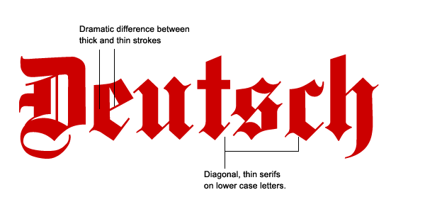
In this class we also learned the history of many types. The first book was printed in Europe by Joannes Gutenberg in the 1450’s. This was the bible. It was printed in traditional blackletter typeface and reflects the style of monkish scribes. By the 1470’s, type prints had developed the first humanist typefaces. William Caxton also brought printing to England. By the 1490’s, Aldus Manutius set up the Aldine Press and invented italic typefaces and smaller hand held books.

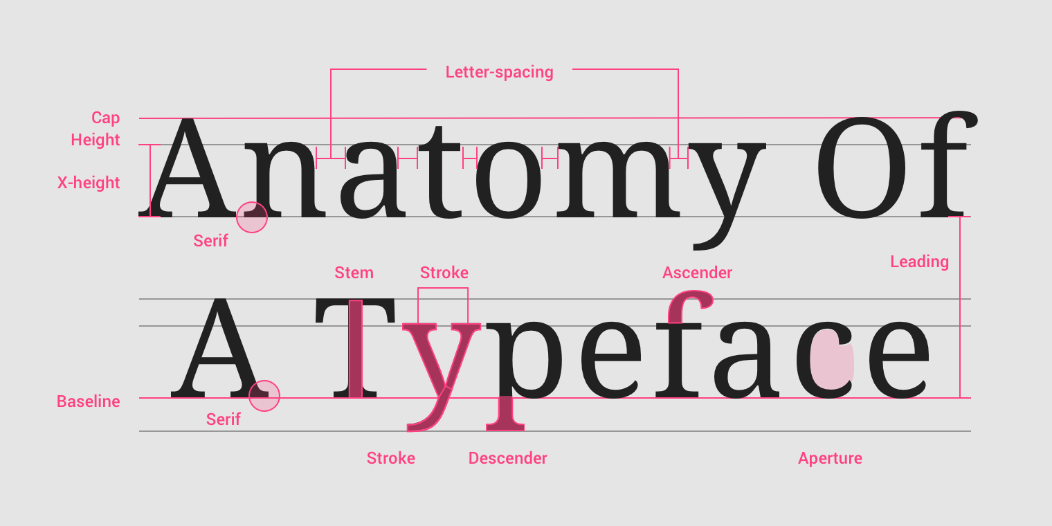
We also learned a lot of type rules during this class which were the following:
- Ideal point size for body type 8.5 – 12 point
- Line length: 80 characters max including spaces. If your lines are longer consider more columns.
- Buy good typefaces for professional work
- Centered or justified body copy can be difficult to read
- Use ALL CAPS sparingly
- Using multiple typefaces can look like you’re throwing a font fancy dress party
- Light text reversed out on black may fill in when printed
- Never, ever artificially stretch or warp type
- Watch your kerning (space between letters). This can cause unexpected swear words, remember MEGAFLICKS.
We learned a lot about how type is evocative. How type makes us feel is a far less researched area than how type functions. It is more difficult to document why a certain typeface looks LOUD or quiet, FAST or S L O W or what it might taste like or feel like. Why so some typefaces feel EXPENSIVE or cheap? A lot of what we know, on this topic as designers comes from personal experience. However, we can and should question these responses and try to understand them better to improve our own design work.
The Monkey Business Illusion was a video we were looking at in terms of supraliminal vs subliminal. Prof. Daniel Simons calls supraliminal communication “inattentional blindness”. A good example would be the scary music in a horror film. We hear the music but when we take it away our perception of the film changes. A magician cleverly misdirects attention away from the viewer to successfully perform a trick. These are all supraliminal. The information is right in front of us we just don’t concentrate on it.
In this class we took a type and sound task. We heard some sounds and had to describe how we felt when we heard them and put fonts to it. We had to:
- Listen to the different sounds in the links to the right
- Using a sheet of paper for each sound and using your choice of material write words, create shapes or textures which are inspired by each sound
- Now create a computer generated file which translates these experiments into a word
- What word will you choose? What typeface will you use?
- Will you use some of the shapes or textures created in combination with your words to convey the sound?
The videos were as follows:
Something that really interested me in this class was instinctive responses to different typefaces that we used in the everyday life.
Some typefaces we respond purely to their shapes. This may be hardwired into our DNA. Perhaps part of our human survival instinct. Round shapes come across as friendly and safe. Jagged shapes show danger or aggression.
We also learned that type faces can be related to a lot of things from the past. Some are universally recognised and some are just.. specific to us. For example.. Around the 1440’s in German, Blackletter typefaces were timeless, educated and monkish. Yet post World War Two Europe, Blackletter typefaces used to and still do come across as evil, death, torture and Nazi Extremism.

We then got another task to do.. the film genre task. In this task we had to:
- Find some examples of movie posters both contemporary and historical
- Find horror, romance, comedy, adventure, sci-fi, kids films, disaster films, action, fantasy etc
- Can you tell the film genre simply by decoding the meaning from the font used?
- Can you find any examples which break from the traditional fonts used for their genre?
- Do these film posters communicate better than the posters using the clichéd font?
For this tasks, I looked at different posters for the same movies which were: Bonnie & Clyde. Stephen King’s ‘It’ and Batman.


From the It poster, you can definitely tell that it’s a horror movies. Both in the older and newer posters.. the type is also red which can mean danger.
In class we took different typography surveys. This one I took first was Type Dating Psychology. I’m going to be honest and say it really freaked me out because I feel like that font really describes me but it also describes the type of person I would date.

I took another survey about what my type is. These are the answers that I got.


